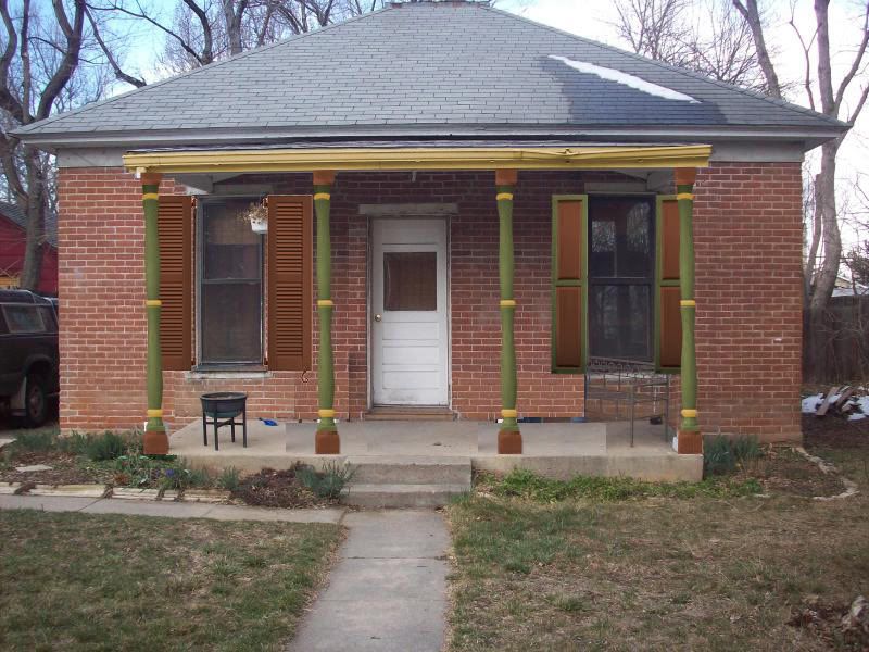
They are really growing on me. I realized that these are just the right size for the porch. It would be prohibitively expensive to buy new posts that are a true 6 inches wide! (At least $300 each, I'm guessing, though I can't even find any that aren't really 5.5 inches.) I think we will just stick with these, unless something comes along first.
UPDATE: They may or may NOT be upside down. (This was photoshopped off of the old pictures- I think it gets the point across either way). I'm convinced it's an optical illusion to all of you! I have evidence in the bottoms of the posts, I think, and I'll take more pictures of the both ways. Plus, I think the posts look REALLY weird the other way... very top heavy.

13 comments:
I think this looks fabulous!
I agree with Jen- Fabulous!
Definitely a great approach. But is that with them flipped over? They still look bigger on top. Or is that an optical illusion?
If not, turn 'em over and the effect should be even better!
Those are great - I renew my sentiment that this is the way to go. Your house is looking so nice!
Very nice. They are still upside down. If you look closely, each section should go from small to large near the bottom. Great choice and nice colors too!
Yeah... they may or may not still be upside down (as that is just a photoshop off of the previous pictures).
BUT... I personally don't think they look upside down. I think they look absolutely weird to have the large bulbs of the middle sections at the top! Very top heavy in person. I'll take pictures both ways to help settle it.
Very cool. Can't wait to see them installed.
I like your old posts. And I love the brown and green color scheme. It looks really good with the brick.
Your house has really gone through some changes!
Yeah, I retract my previous comment about turning them the other way. I think maybe the old photo made the top curve look larger than the bottom...this one makes them look even. Sometimes I think you just have to live with something for a while and it eventually become clear, huh?
I think these are the winners. But won't dare say which side is up. No idea.
I like 'em! I really do. Wish I could've found something like this for my porch, but architectural salvage is really expensive around here. Lucky you to find these for free!
Excellent choice! Your color palette looks wonderful with the brick.
Looks like the place to put a hanging porch swing! or a glider
Post a Comment